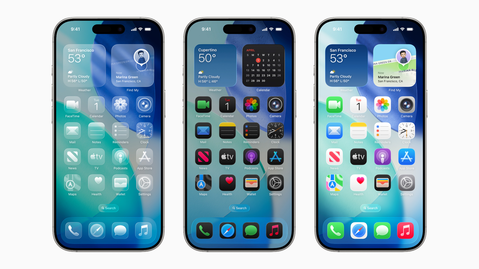
When iOS 26 launched, it brought with it a sleek new visual language dubbed “Liquid Glass” — and now, with the latest update iOS 26.1, you finally have the power to tweak how it appears. In this post, we’ll explore the update in depth, walk you through how to enable the setting, examine why Apple introduced it, and discuss how it could affect your experience.
1. What is the Liquid Glass design?
With iOS 26, Apple introduced Liquid Glass as its boldest design shift in years. Apple+2Tom’s Guide+2 The idea: UI elements such as menus, toolbars, and app icons behave and appear like fluid glass — translucent, layered, and refractive. The intention was to bring depth and elegance to the user interface.
However, although many users appreciated the aesthetics, not everyone was a fan of how the design affected readability, contrast and visual clarity. TechRadar+1
2. Why Apple added the new setting in iOS 26.1
Because of the mixed feedback, Apple responded by introducing a new toggle in iOS 26.1 that allows users to switch how transparent or opaque the Liquid Glass effect appears. MacRumors+2MacRumors+2
Specifically:
- The new menu gives you two options: “Clear” (the original, more transparent look) and “Tinted” (increased opacity, more contrast) for Liquid Glass. MacRumors+1
- Apple made this change after receiving user feedback that some found the ultra-transparent design hard to read or distracting. MacRumors+1
- The toggle is part of the Display & Brightness (or Appearance on Mac) settings so you can easily adjust it yourself. 9to5Mac+1
3. How to enable or switch the Liquid Glass setting
Fortunately, switching the setting is straightforward. Here’s how to do it:
- Make sure your iPhone is updated to iOS 26.1 or later. Tom’s Guide+1
- Open Settings → Display & Brightness.
- Scroll to find Liquid Glass. (On Mac: System Settings → Appearance.) MacRumors+1
- Choose between Clear (more transparency) or Tinted (more opacity and contrast).
- The change applies immediately across the interface in supported UI elements.
Here’s a quick checklist to keep in mind:
- If your background wallpaper is busy or dark, Tinted may improve readability. Republic World+1
- If you like the original glass-effect look, stick with Clear.
- The toggle doesn’t fully “turn off” Liquid Glass — it adjusts its appearance. For more drastic changes you can also use Accessibility settings. TechCrunch
4. Where you’ll see the effect and limitations
While the setting applies to many parts of iOS, it doesn’t affect everything. Here’s what you should know:
- It covers UI elements such as notification banners, toolbars, and certain in-app navigation panels. Republic World+1
- Some areas remain largely unchanged — for example, the Home Screen icons and Control Centre may still display transparency similar to before. Republic World+1
- If you use third-party apps that adopt Liquid Glass, the preference should carry over — assuming the app supports it. 9to5Mac+1
In other words: the change is helpful and meaningful, but it’s not a complete redesign of the interface — it’s a customization option.
5. Benefits of switching to “Tinted”
If you opt for the Tinted mode, here are the main advantages:
- Improved readability: With more opacity and stronger contrast, text and UI elements stand out better — especially on busy wallpapers or in bright light. Gadgets 360+1
- Reduced distraction: If the frosted, highly transparent look of Liquid Glass felt too “see-through”, the tinted mode gives you a calmer, subtler interface.
- Personalisation: It gives you more control over your iPhone’s look and feel — moving away from a one-size-fits-all design.
That said, you may trade some of the “glass-like” elegance of the transparent look for more practicality. If you care more about aesthetics, you might prefer to stay with Clear mode.
6. Use cases: When to switch and when not to
Here are some scenarios when you might want to choose one setting over the other:
- If you use a photo or patterned wallpaper with lots of colours and shapes, switching to Tinted will help make UI elements more legible.
- If you frequently use your iPhone outdoors or in bright light — where transparency can reduce contrast — Tinted is a smart choice.
- If you prefer a minimal or clean look, and you don’t mind the transparency effect, stick with Clear.
- If you have accessibility needs (for example, difficulty reading translucent elements), you might go further by using Accessibility options like “Reduce Transparency” in addition to Tinted mode. TechRadar+1
Ultimately: it’s about finding the balance between style and function that works for you.
7. Final thoughts: Why this matters
While the feature may seem like a small tweak, it signals something important: Apple is listening to user feedback and giving more customization — rather than forcing everyone into the same aesthetic. By adding the Liquid Glass toggle in iOS 26.1, Apple acknowledged that one design doesn’t fit all. TechCrunch
Moreover, for many users, this setting could enhance day-to-day usability by making interface elements easier to see and interact with — which means less strain and better experience.
So, if you’re using an iPhone compatible with iOS 26, it’s worth checking out the new Liquid Glass setting. Even if you love the original look, it doesn’t hurt to experiment with Tinted mode — you might find a look that better suits your usage and environment.


